Recently, maybe you’ve also come across the term UX (User experience) or CX (Customer experience). If you do business and your selling channel is the Internet, you operate some sort of an e-shop, booking system or website you may wonder what exactly is UX and if it’s worth investing in.
We’ll get back to the investment part later, let’s explain it all first. Maybe, generally, there is an opinion that the improvement of your website’s UX is done by a company which analyses your website, takes a look at where people click and where they don’t as well as where they have issues in terms of conversion route. Based on this audit they create a modification plan which is implemented, introduced and re-evaluated. Yes, very simply put, but it’s basically true – this is how you perfect your website’s UX.
But today we’re not only talking about websites. Try to look at the following situations and evaluate them from a customer’s point of view – would you appreciate a 3-day or one day delivery? Would you get more joy from an ordinary box or a box on which the sender wrote your name and wished you a great day? Settlement of a claim or replacement of goods within 7 or 31 days?
At the beginning of all the attempts to improve UX there has to be a realisation that the customer journey has not ended with the click on the “Binding order” button. Whereas in the process of ordering a customer is more willing to excuse technical imperfections once the order for your services is confirmed their relationship with you becomes, so to speak, personal. And you don’t want to ruin your personal relationships, do you?
Your website’s UX has to go hand in hand with the entire UX of your business. One can’t work flawlessly without the other. If you invite a third party to resolve your website’s UX, it has to be an expert who has to understand that your website has to respect the succession of your back office practices, whether it's product sending or service delivery. UX is simply about a bigger experience that’s related to the use of your services.
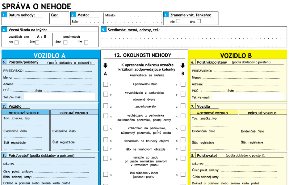
Let’s give an example from everyday life – maybe you’ve also had the non-pleasant experience of being involved in a car accident. You had to fill in this form:

Imagine – you are standing at the edge of a road, still stressed, your hands are shaking even though the damage might not be high. And you are wondering – why do I have to fill in the name and insurance company head office, when I’ve written down the number of the insurance contract? Why do I have to write down my home address and contacts, when I’ve written down the number of the insurance contract? Yes, the number of the insurance contract is the identifier based on which it’s possible to find this data at the insurance company. Now I’m not judging the format which can be based on legislation. I’m referring to the fact that the form itself has weak UX while the insurance company, to which you’ll send it, might have an almost perfect website. I could also point my finger at the paper claim form that e-shops pack into boxes for their customers. Wouldn’t it be enough to have a form at the website where the customer enters their e-mail and an order number? It would, in our systems.
Now, let’s get back to one of the original questions. Should I invest in UX? You’ve probably guessed the answer already, yes, you should. However, you should do it one step at a time – first of all, analyse where your weaknesses are, start from the biggest ones which can be removed the quickest.

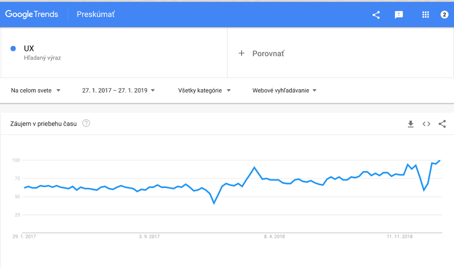
Another reason is the competition’s modernisation which translates into the rising demand in Google trends. Hurry up, so you don’t lose your competitive advantage. Are you wondering how much it will cost? Continue to follow our articles and you’ll find out soon.

 Rudolf Rebry, 26. January 2019